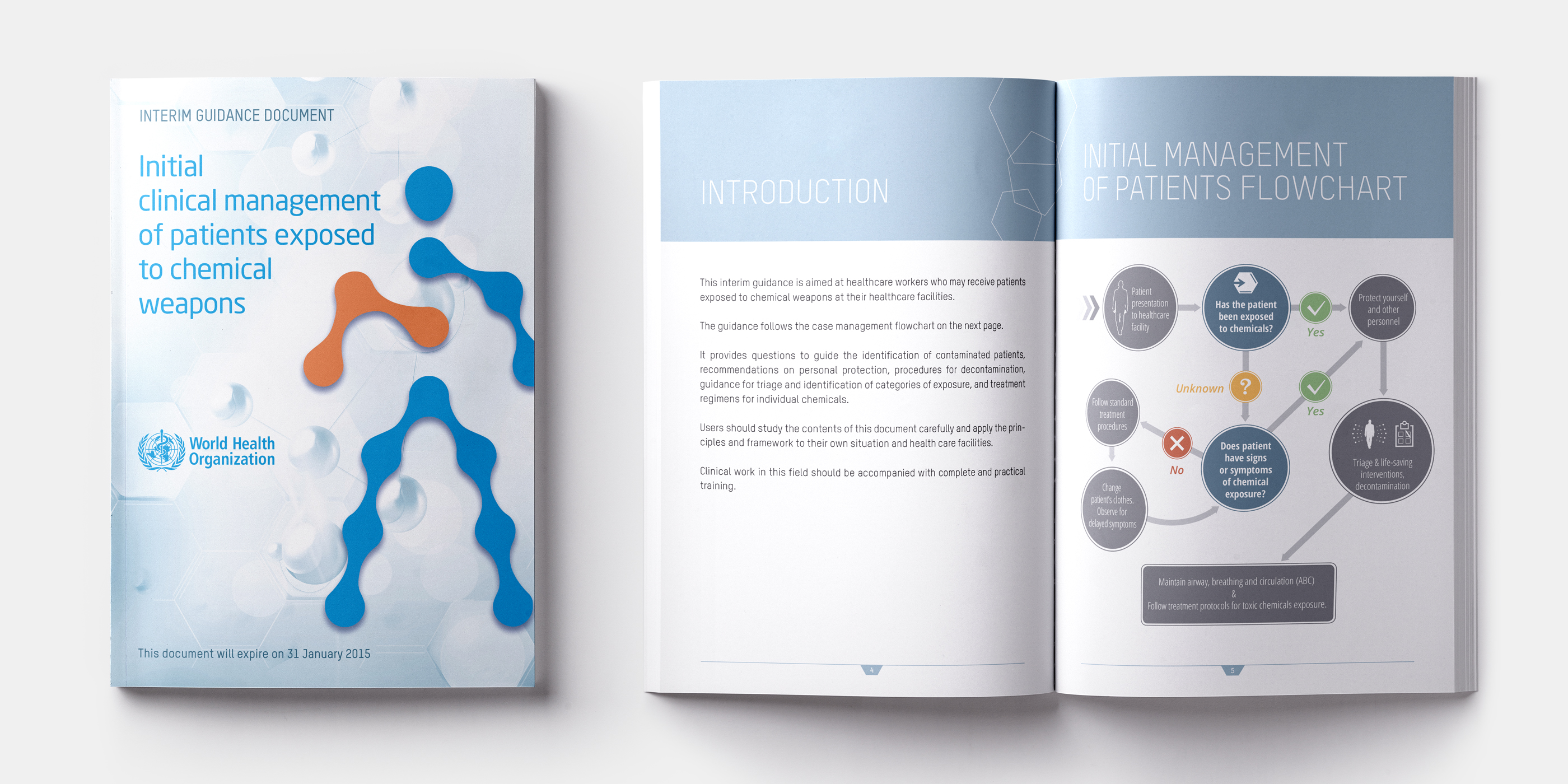
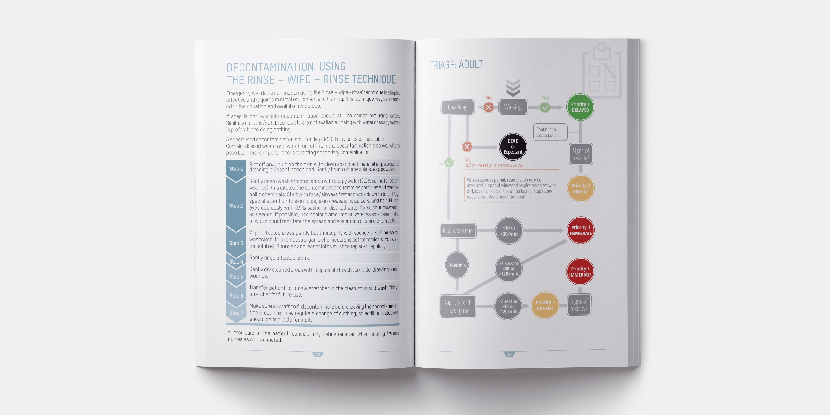
The World Health Organization, WHO, contacted me to develop the visual identity of a series of technical publications for the management of medical emergencies. The development of the cover contains elements reminiscent of genetics and chemistry, maintaining institutional colors of the WHO in contrast with orange, a symbol of danger.
The graphic project was developed from the conception to the finalization in autonomy, without the help of other professional figures.


